We love a good before and after, and Thomboy Properties’ stunning transformation of a 1975 Hal Lacy residence certainly did not disappoint!
The Indian Canyons home first debuted as the Modernism Week Social House in 2018, and featured an aesthetic that combined the best of two desert styles: Palm Springs and Marrakech. Follow along as we revisit this mod makeover!
Entry
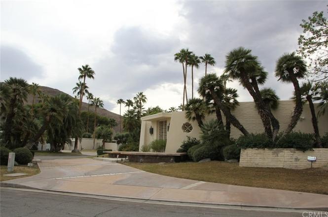
Before: This custom built 5000sf home is located in Indian Canyons, and was originally designed in 1975 by architect Hal Lacy.
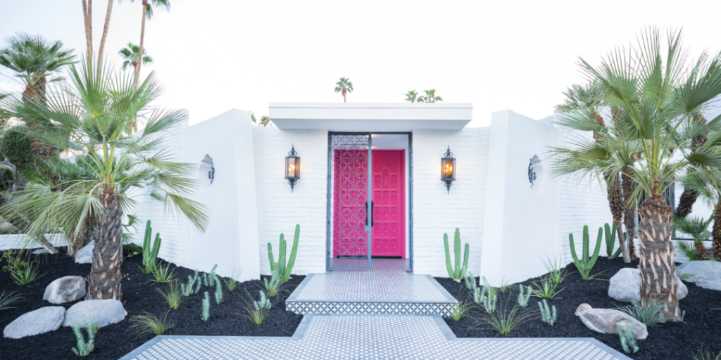
After: A fresh coat of Dunn-Edwards paint on the exterior walls and original custom carved 10-foot high double entry doors adds a fun pop of color. Decorative medallion cutouts and the metal screens inspired the overall “Moroccan Modern” design vision. Desert-friendly landscaping by Mountain States Wholesale Nursery complements the architecture of the home.
Living Room
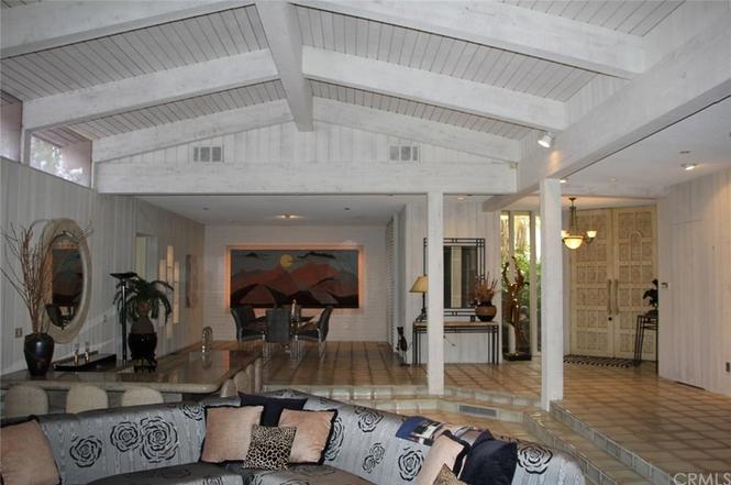
Before: Beamed ceilings, clerestory windows, a sunken living room, and an open floor plan provided the perfect foundation for Thomboy Properties to push their creative and design talents to the limit.
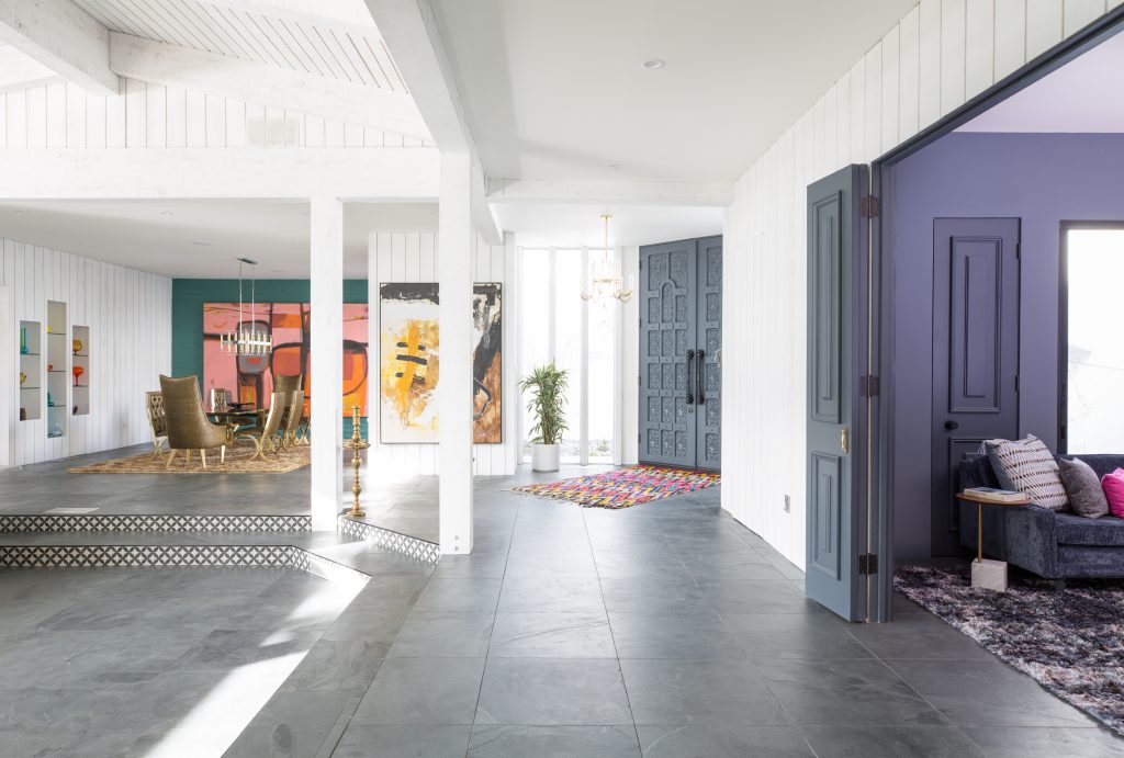
After: Thomboy Properties honored elements of Hal Lacy’s original design, while adding modern updates like new paint and flooring. The interior-facing side of the intricately carved entry doors were painted a dramatic shade of Dunn-Edwards‘ “Edge of Black.”
Dining Room
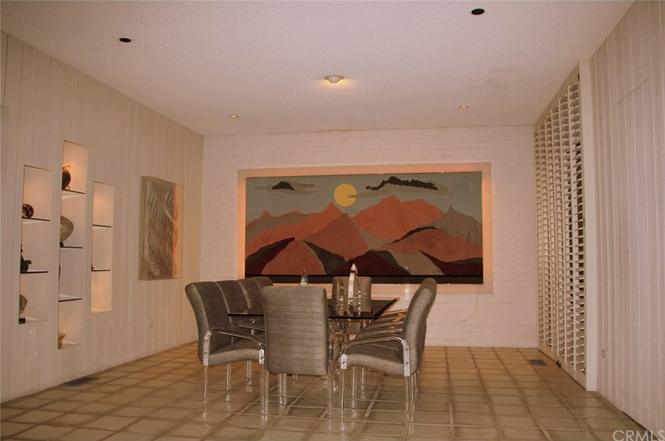
Before: The formal dining room included original built-in shelving, a butler’s pantry and access to a front interior courtyard.
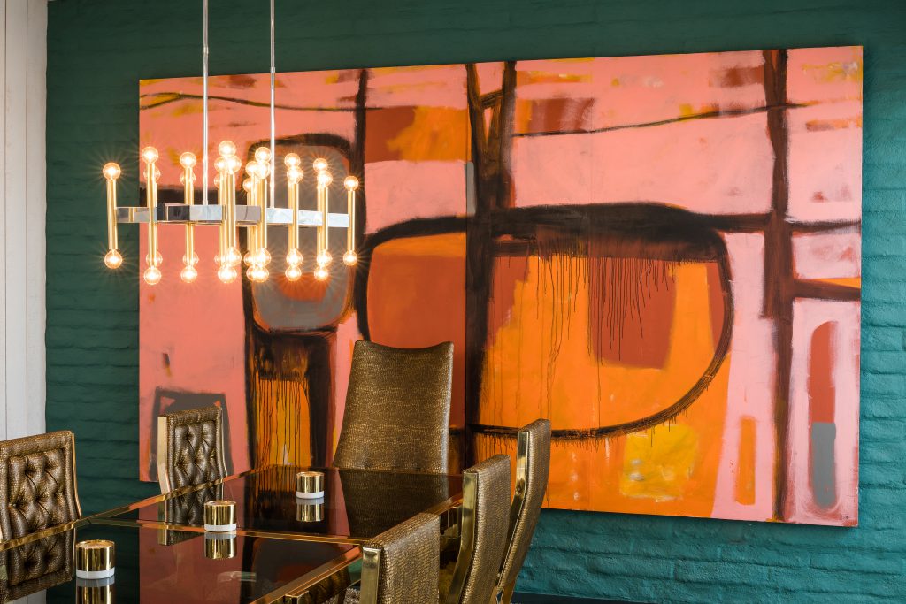
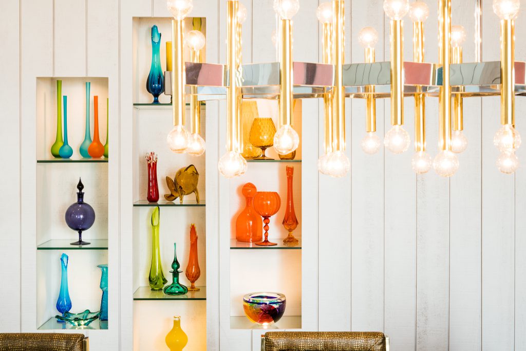
After: A bold accent wall, fresh artwork, statement lighting by Ferguson Bath, Kitchen & Lighting Gallery, and styled shelves elevate this dining space.
Sunken Bar
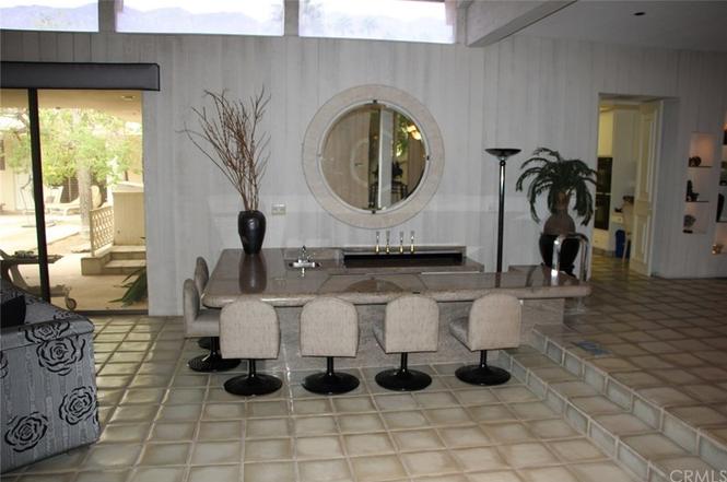
Before: In our humble opinion, every home should have a sunken bar! This neat feature was designed for entertaining, allowing guests to comfortably wander between the dining room and living room areas.
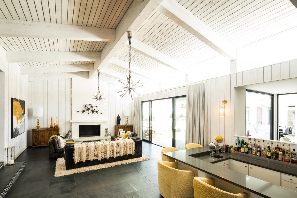
After: Corian countertops replaced the original granite bartop, and a newly added wall cutout opens into the kitchen, allowing even more natural light from the courtyard to flood the home.
Kitchen
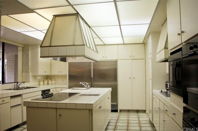
Before: Cream tile, fluorescent lighting, and simple – but outdated – kitchen cabinets were in need of a major refresh.
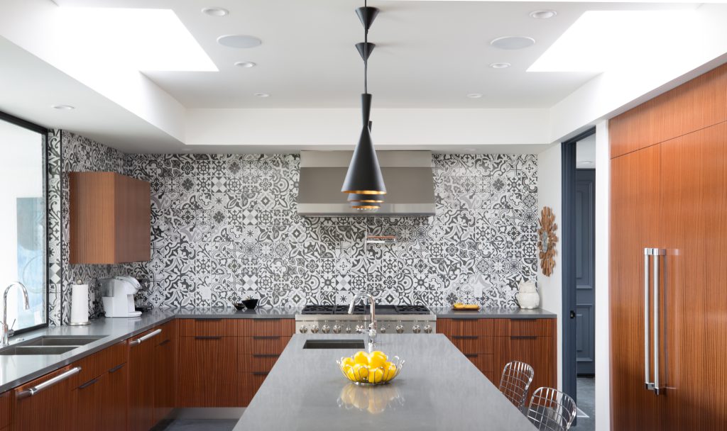
After: Patterned tiles allude to the home’s Marrakesh vibes, while sleek pendant lighting, new cabinets, and modern appliances from Thermador (including 60″ of refrigerator/freezer, dual dishwashers, 48″ range, prep sink and a wine vault adjacent to a laundry room) take the kitchen from drab to fab.
Media Room
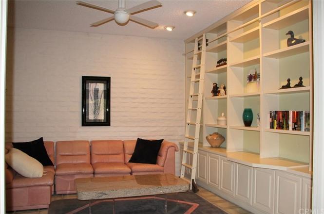
Before: This private space is adjacent to the common area, with double doors to offer optional privacy. Original features include custom built-ins and a brick wall.
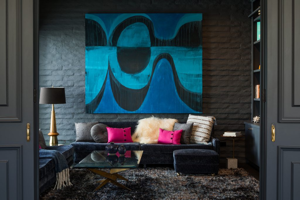
After: The original built-ins and brick wall received a fresh coat of paint in a sophisticated grey hue. Decorative accents mirror the color scheme and Moroccan Modern theme throughout the home. Custom artwork by local artist Shawn Savage draws the eye into the space.
Master Suite
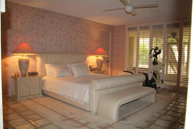
Before: While spacious, the master suite interiors were in need of a major update.
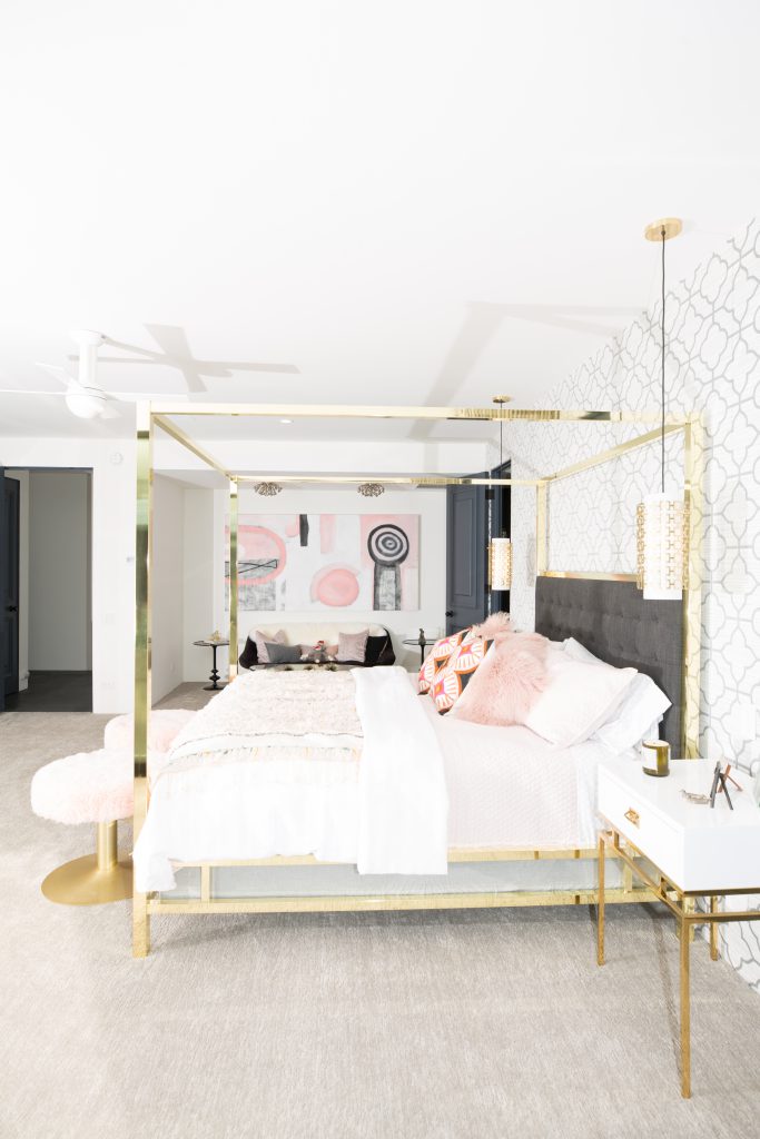
After: Textiles from Palm Springs’ own Soukie Modern, luxe gold accents, patterned wallpaper, and bright white paint make the room feel airy and light. The master suite also includes multiple closets, dressing and sitting areas.
Master Bath
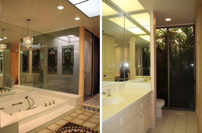
Before: Hello, mirrored walls and fluorescent lighting!
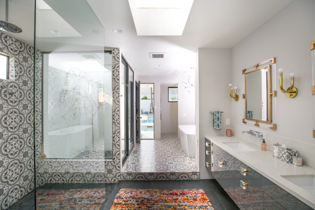
After: The sunken tub was replaced by a freestanding bathtub in a modern silhouette. Additional upgrades include a dual-head walk-in shower, cedar sauna, Moroccan-inspired tiles, chic lighting accents, a skylight, and atrium.
Guest House
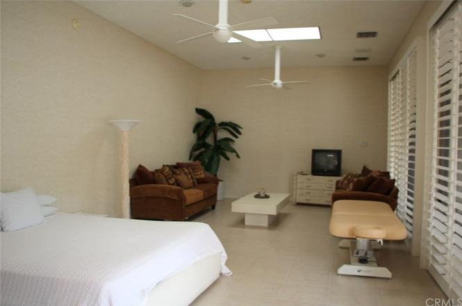
Before: A 630 square foot guest house sits adjacent to the home’s pool and courtyard.
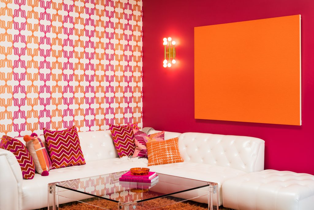
After: Recognize this color? The front door’s iconic pink is carried into the accent wall and wallpaper of the guest room, offering a punchy, vibrant space for guests to escape.
Courtyard
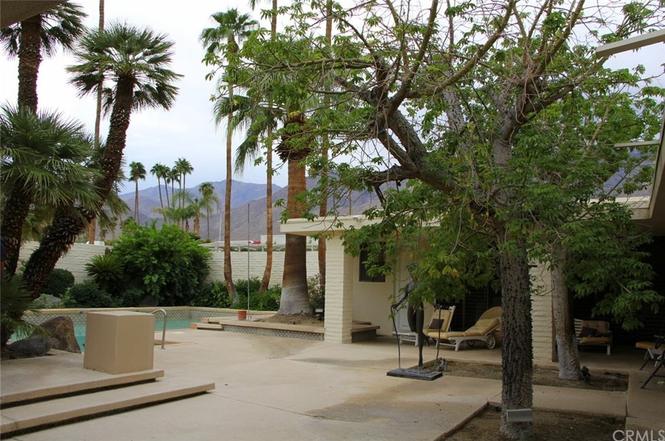
Before: The original courtyard was expansive, but overgrown trees inhibited views of the San Jacinto Mountains.
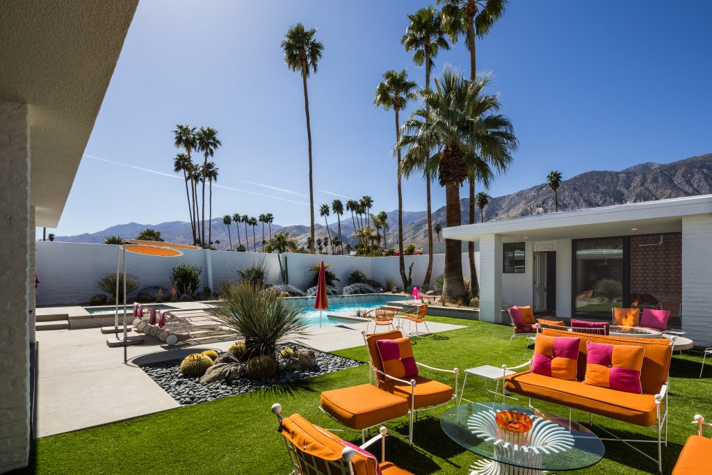
After: Clean landscaping, native plants, and plenty of room to lounge make this private courtyard the perfect place to enjoy the desert sun.
Outdoor Dining Patio
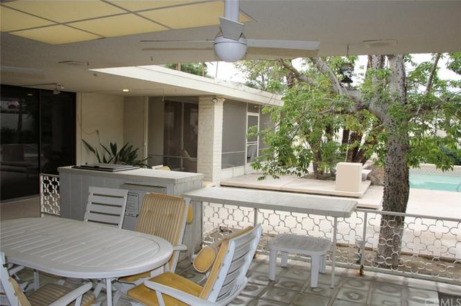
Before: A fun patterned fence separates the covered dining patio from the courtyard and pool.
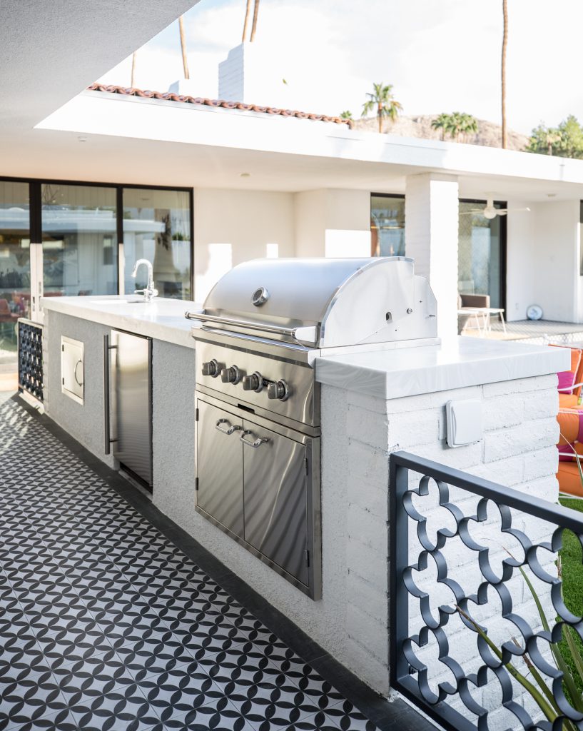
After: The original fence was refreshed with new black paint, while the island was expanded to include new Thermador appliances (like a grill and mini fridge) and outdoor sink.
Pool
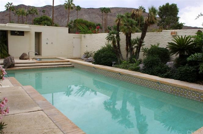
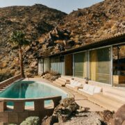
Before: Brick and concrete surround the pool, with boulder accents placed intermittently throughout the pool area.
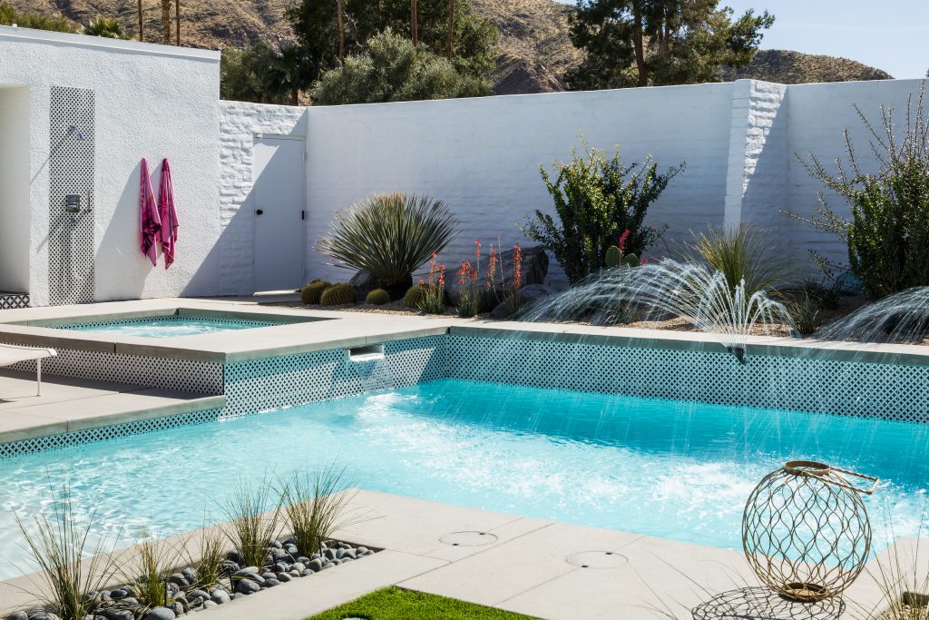
After: The patterned tile around the pool echoes the tile used on exterior surfaces around the courtyard, like the outdoor shower, patio floor, and steps.
Special thanks to Modernism Week sponsors Ferguson Bath, Kitchen & Lighting Gallery, Corian Design, Dunn-Edwards Paints, DXV, Thermador, and more.
“Before” images courtesy of CRMLS. “After” images courtesy of Jake Holt and Fred Moser.

