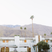
Each February and October, Modernism Week selects “Featured Homes” for guests to explore. In October, we are excited to share the Modernism Week Featured Home: Hi-Sun, a bright and airy recently restored mid-century modern gem.
Hi-Sun was originally designed in 1963 by Charles Du Bois and built by the Alexander Construction Company as the model home for the Las Palmas neighborhood’s Summit Estates development. It also happens to be the residence of Kevin Kemper and Howard Hawkes, the design duo behind H3K Home+Design. M recently caught up with Kevin and Howard to learn more about how they created Hi-Sun together, their unique design approach, and why cheap is actually expensive.
What was your inspiration for the design of Hi-Sun?
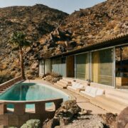
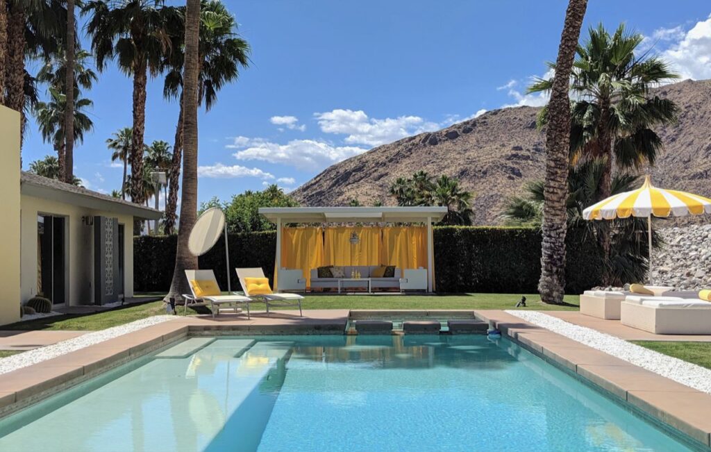
H3K: Any project we work on is influenced by the architecture, how the site is laid out and most importantly the aesthetic of the homeowner. In the case of Hi-Sun, we are not only the designers, but the clients, which can be a doubled-edged sword! We love so many elements, so how do we make those final decisions and choose the final direction. One of the biggest inspirations of the design of this house is the architecture itself. The house was designed by Charles Du Bois and built by the Alexander Company as one of the last subdivisions the Alexanders built before their tragic end. It was built during a period when Polynesian influences came into play in modernist architecture, especially the Coachella Valley. Hawaii had just become a state in 1959 and the movement of tiki bars such as “Don The Beachcomber” were in full swing. In fact the real estate agent for this neighborhood was known as Aloha Bob and he’d welcome each new buyer to their home with a lei. The original architecture of Hi-Sun house reflects this design ethos of this period. Though not an exact interpretation of Polynesia, the wood shake roof, raised brows, dark rock, playful deco block, and pavilion roofline certainly have the Tiki nod. We, of course, took this into account with renovating the house. The reintroduction of deco block and reinstallation of a wood shake roof top the list of our improvements!
What was the project like before you started?
H3K: Luckily, this house had been completely renovated in 2008, which meant all the mechanics of the house – plumbing, electrical, HVAC – had been brought up to current standards. Not only did this mean a savings in the construction costs and time, it meant we could concentrate on the design and aesthetic itself. We purchased the home in 2010 as a foreclosure but we hadn’t spent the time and money to make it our H3K home as were to busy with client projects. We are excited to not only complete the renovation, but also be able to share it with Modernism Week friends and fans!
What is the coolest material you used and why did you choose it?
H3K: The reinstallation of the shake roof is probably the biggest and coolest material re-introduced to the property. Many people think that with the fire codes in California it is impossible to install a wood shake roof. This is where technology steps in and helps you out! There is a new wood shake product that is natural wood but meets California fire codes – a Class B fire treated wood! Because we had the photo of the original house from 1963, we could demonstrate that it had a shake roof and it was key to the architecture of the house design. Without the wood shake, the house loses its edge as a piece of cool MCM architecture.
For this project, how did you incorporate your design aesthetic?
H3K: As designers, it is sometimes difficult to hone in on one specific style or aesthetic. Our overall aesthetic are clean lines, color, and a definite Palm Springs vibe and feel. We think tour-goers will see this aesthetic in the house, but we are also influenced by Brutalism, so visitors will see elements of this style as well. The touch of Brutalism really does work with the architectural and environmental aesthetic of the house. The bold rock entry wall and fireplace plus the desert mountain view of the backyard pair perfectly with this direction.
What’s one design trend you wish would come back or catch on?
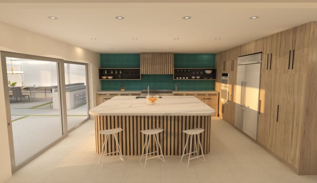
H3K: Enclosed or partially enclosed kitchens. We know that’s probably surprising to hear, but when entertaining, messy kitchens aren’t attractive and who wants to be cleaning up your kitchen while enjoying the company of your friends? In a lot of design projects, we keep this mind and there are ways to keep the sins of a party out of sight in an open kitchen. Raising the exposed edge of a kitchen island to bar height to shield the sink is one of them— even a deep sink is helpful. In this project, we have created a small butler’s kitchen in the garage to assist with this objective.
What’s one time or money saving design hack you have for our readers?
H3K: There is an old adage, “Cheap is Expensive,” and we have seen the truth of this many times in our career. Clients sometimes want to save money by cutting corners, going for a sub-standard product or rushing the process. These methods may work in the short term, but in the long term, the time and money required to correct these issues outweighs any savings on the front end. That is not to say you need to buy the most expensive product,—but do research, take time planning, and slow down a bit. It saves a lot of headaches!
Hi-Sun will be on tour each day during Modernism Week — October (October 13-16, 2022) with the generous support of Brizo, Dunn-Edwards Paints, Ferguson Bath, Kitchen & Lighting Galley, JennAir and Willis.

