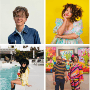
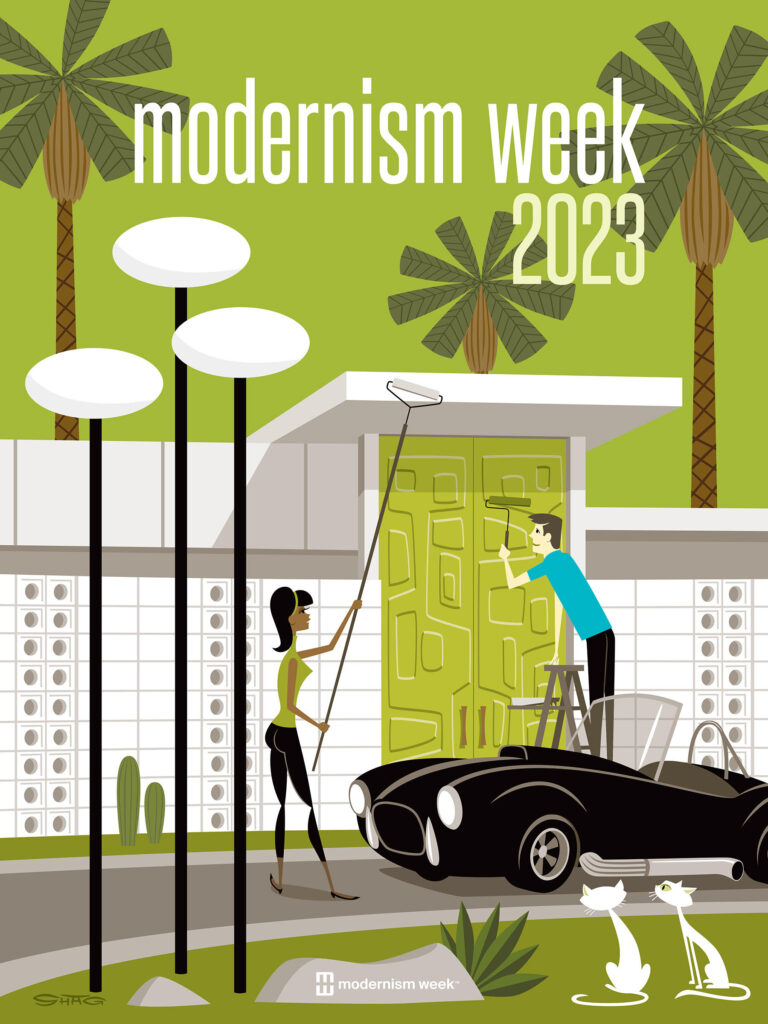
The clean, modern and narrative-based work of Josh Agle, who works under the moniker “Shag”, has become an integral part of promoting the Palm Springs mystique. The illustrative paintings, aptly described as “mod characters in swanky spaces rendered in saturated colors,” conjure up the idealized Palm Springs, anchored in an idyllic fantasy of the 1950s and 1960s, complete with that era’s singular architecture and iconic furniture and accessories. In fact, the popularity of Shag’s work and the compelling lifestyle that they capture were a part of Palm Springs’ renaissance.
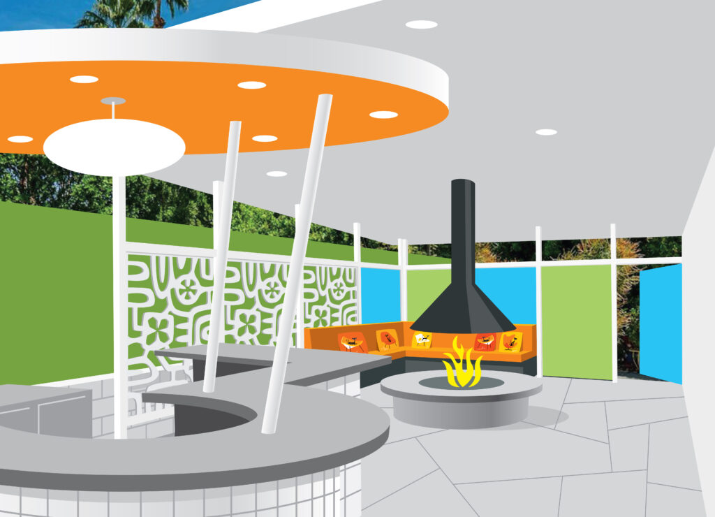
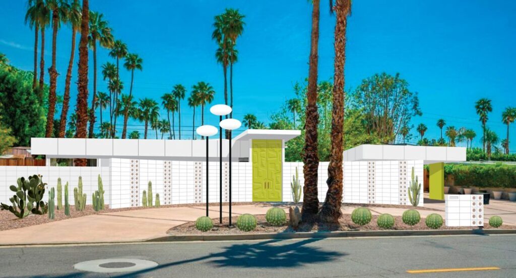
Now, with the Modernism Week Featured Home: The Shag House debuting at Modernism Week on February 23, 2023, he’ll turn those 2D visions into 3D reality, bringing things full circle.
When did Josh Agle become “Shag” and why?
I first used the name “Shag” around 1990 when I started my career in the record industry as an illustrator and graphic designer. Later, in the mid 1990s when I started showing my paintings in art galleries, I kept the name. It’s a contraction of the last two letters of my first name and the first two letters of my last name. As my paintings gained notice, I was able to exhibit in galleries worldwide and establish my reputation as a fine artist. In 2010 my business partners Jay and MiShell Nailor opened the Shag Store in Palm Springs, a gallery dedicated to my art and merchandise.
Who or what do you consider the major influences on your distinctive style?
I was influenced by commercial illustration and jazz album covers of the 1950s and 1960s. In those images, the figures and forms were simplified and manipulated in ways which were considered avant-garde at the time. Decades later, I wanted to use those same methods to try and create fine art. While I had never seen anything similar in an art gallery, it was the kind of art that I wanted to see on my own walls. I amped up the colors and used irony and dark humor in the paintings. The response to the work was immediate and overwhelming. Since then, many other artists have adopted a similar visual aesthetic, so it’s not uncommon to see this type of work in galleries and stores now.
Your work is intimately tied to what people think of as “Palm Springs Style”. Can you talk about the origins of your relationship with the city?
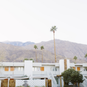
I had included midcentury furniture and settings in my earliest paintings, and was aware that Palm Springs had been a hub for midcentury architecture and design because I consumed books and vintage architecture magazines. Around the same time, in the mid 1990s when I started painting, Palm Springs experienced a budding renewal of interest in its architectural heritage, though it was mostly still known as a place for elderly people who liked to golf. While I started painting Palm Springs-inspired work, it was aspirational. I was depicting what I wanted the city and Palm Springs lifestyle to be: younger people enjoying poolside drinks or attending parties wearing colorful cocktail attire in colorful midcentury surroundings. I began exhibiting at M Modern Gallery on Palm Canyon Drive in 2002, and a synergy between my art and Palm Springs began to develop. Some people who were already in Palm Springs took inspiration from my art. Others came to Palm Springs because they’d seen the city in my paintings. Eventually the city began to look a lot more like my art and the aspiration became reality.
How does midcentury modern architecture and design figure into your work?
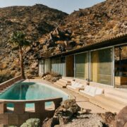
I was into midcentury modern architecture and design before I started making fine art, so it was natural that I would include it in my work. I studied architecture my first year in college, so I had an appreciation for good design, and I developed a love of the furniture from seeing it in thrift stores and flea markets. The midcentury aesthetic acts as the setting for my paintings, though I don’t believe they’re set in the 1950s or 1960s.
How are you planning to translate your work, which has been described as “mod characters in swanky spaces rendered in saturated colors”, from 2D to 3D?
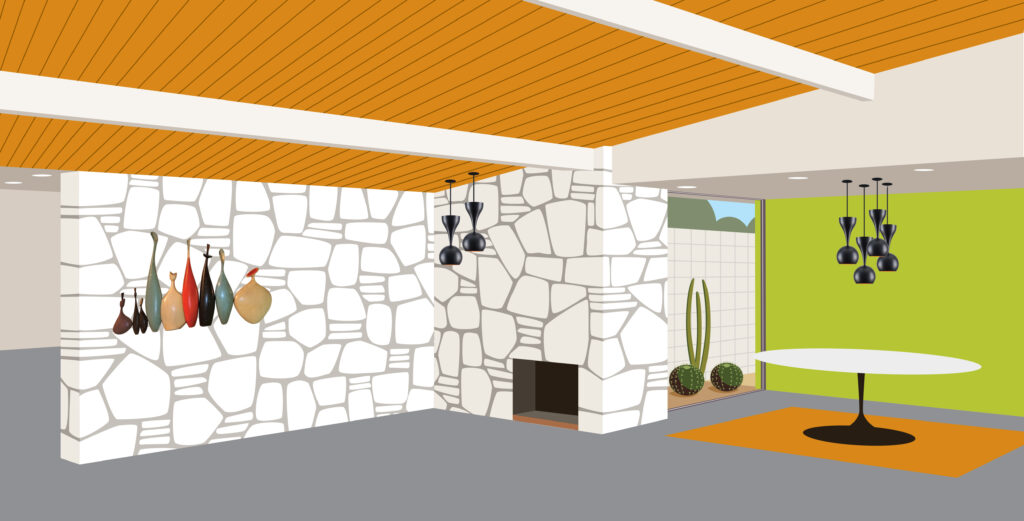
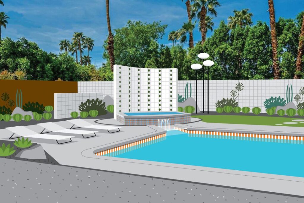
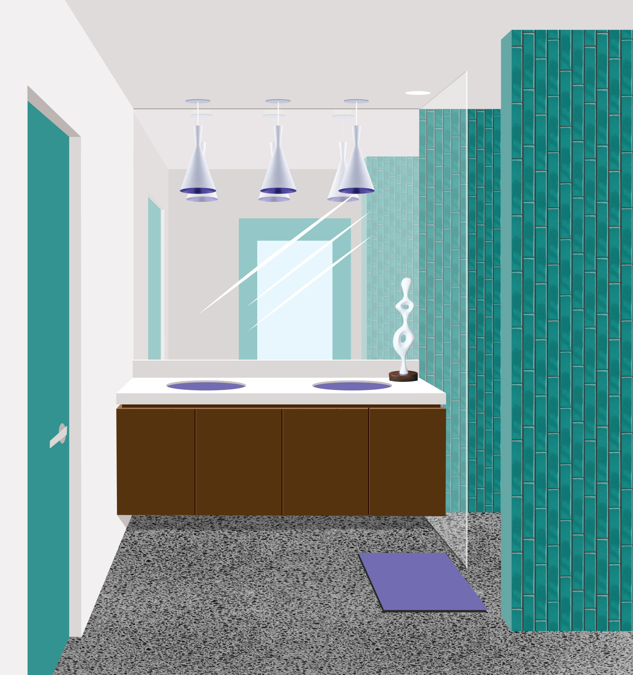
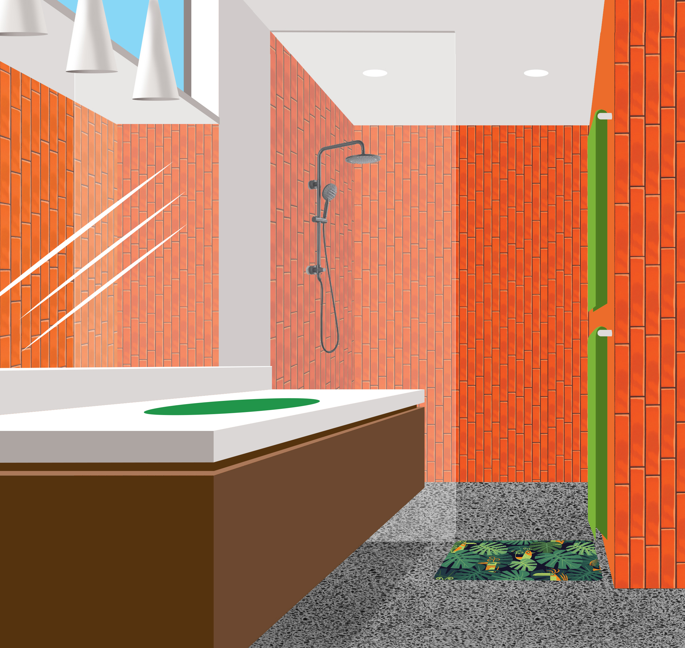
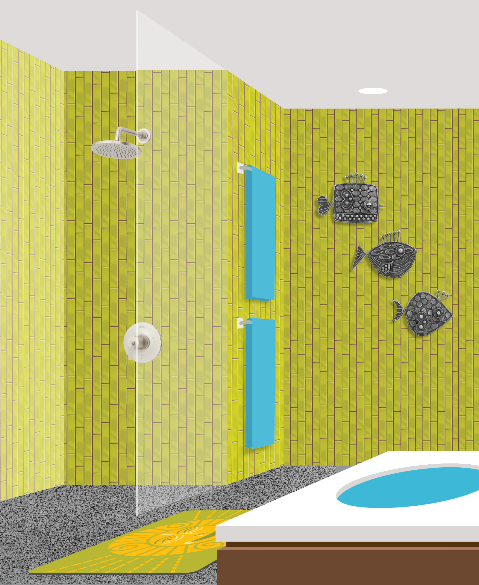
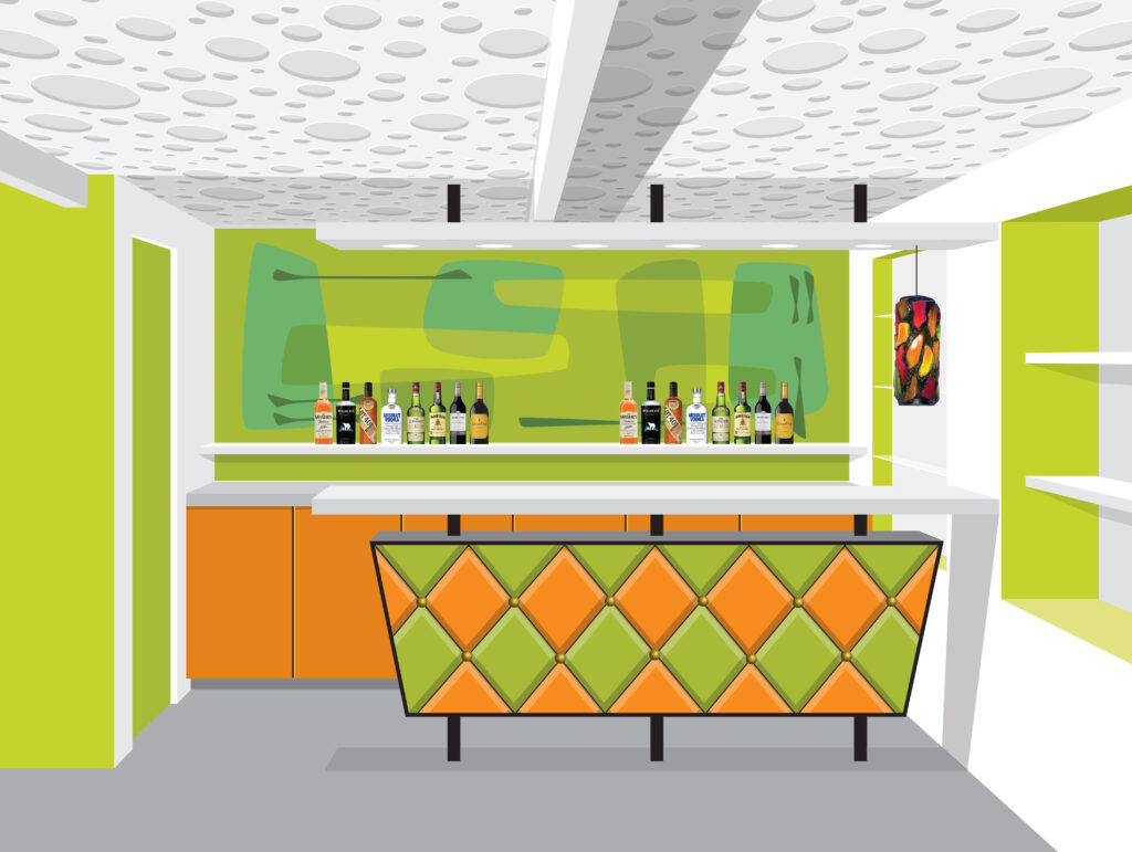
It’s tricky because many more things come into play when designing a house than when making a painting. Budget, code restrictions, livability and practicality all have to be balanced with a desire to create a space that feels like one of my paintings. I’ve taken color palettes and themes from my art, and put playful elements and “wow” moments into the design in an attempt to make it something unique and “Shag-like.” Some of the features of my paintings, like swimming pools running through the living room and interior waterfalls, were not achievable — but maybe you’ll find them in the next house that I design!
